Brief
In 2022 Fable launched its new web-based motion design tool set to shake up the motion design world. In its early stages Fable needed a brand new coat of paint to match its exciting product, so I had the chance to design a whole new look for the new animation tool in town.
Fable’s mission was to make animation more accessible to designers, marketers, and creatives; without the need for complex software. We set out to craft a brand that resonated with both newcomers and seasoned professionals seeking alternatives. Our goal was to create a vibrant, refreshing identity that not only broke away from legacy creative software but also reimagined what the future of design tools could be.
In order to find the right look and feel we needed to find the right balance between playful and professional, and that's where my job started.


Logo
The Fable logo remained unchanged, serving as a strong foundation for the brand’s evolution. Instead of altering the mark, the rebrand focused on expanding its visual identity—introducing refreshed typography, color, illustration, and motion design to create a more cohesive and dynamic presence across digital platforms.


Typeface
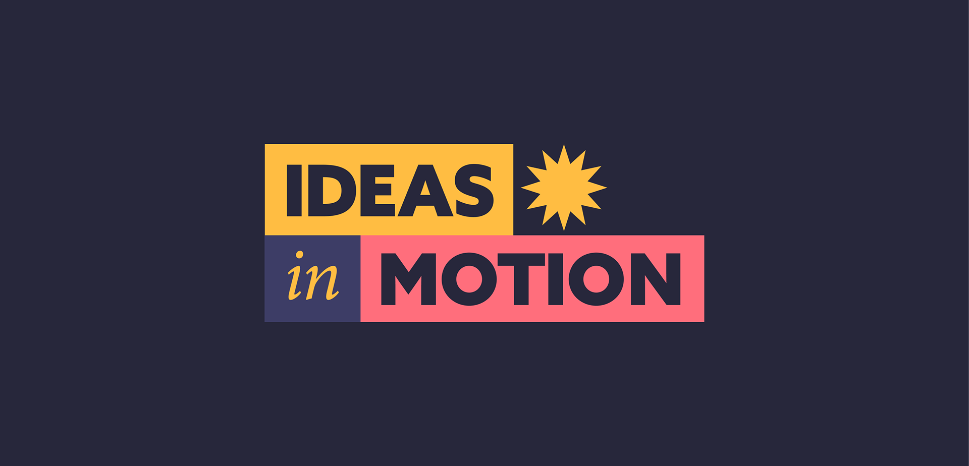
GT Walsheim Pro and Canela Text Light create a balanced contrast between modern structure and refined elegance, making them the perfect pairing for this brand. GT Walsheim Pro’s bold, geometric forms provide clarity and strength, while Canela Text Light adds a touch of sophistication and warmth. Together, they establish a versatile and visually engaging identity that enhances readability and brand personality across web, social media, and motion design.

Color
While the original Fable colors were functional, they lacked the energy Fable aimed to convey. Rather than completely reinventing the brand’s identity, I focused on sharpening and refining its aesthetic.
I started by intensifying our primary colors to bring more vibrancy to the composition. Then, I expanded the palette with lively hues that complemented the core colors, adding depth and dynamism.

Original Palette

New Color Palette, Color Proportion and Color Interaction
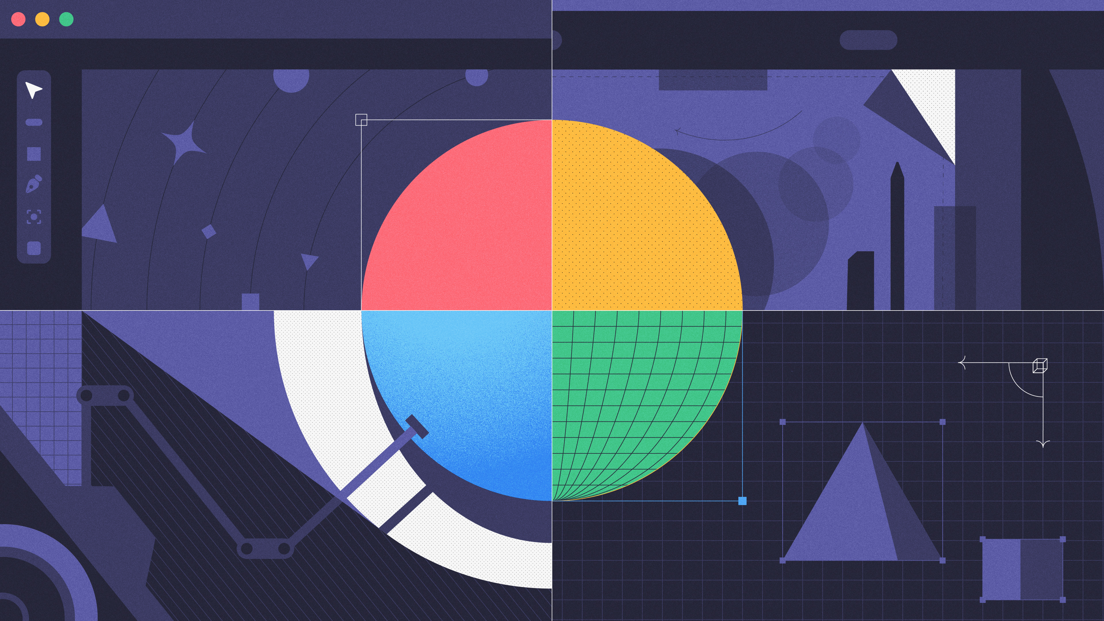
Art Direction & Illustration
Adjusting the colors was a great start, but the real challenge was translating this palette into compelling content.
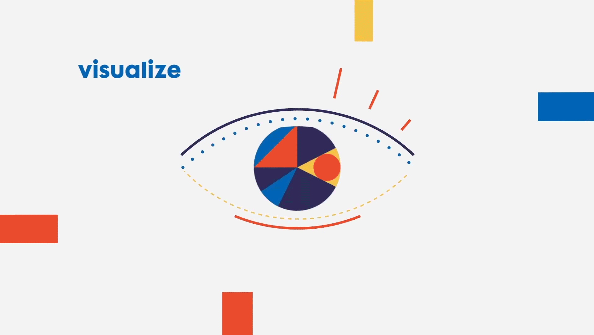
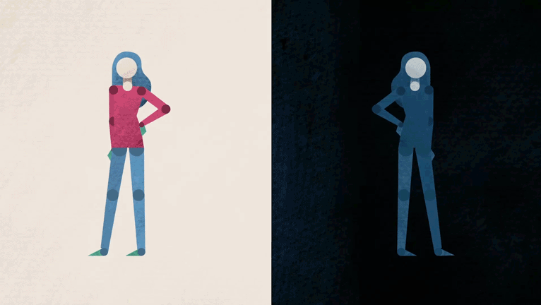
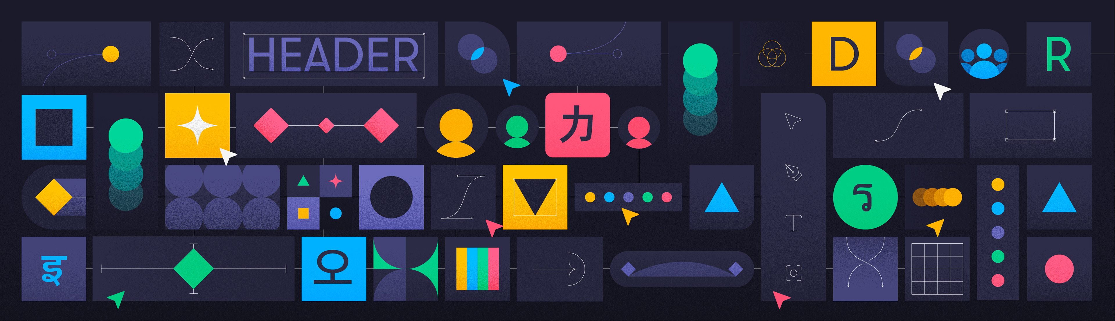
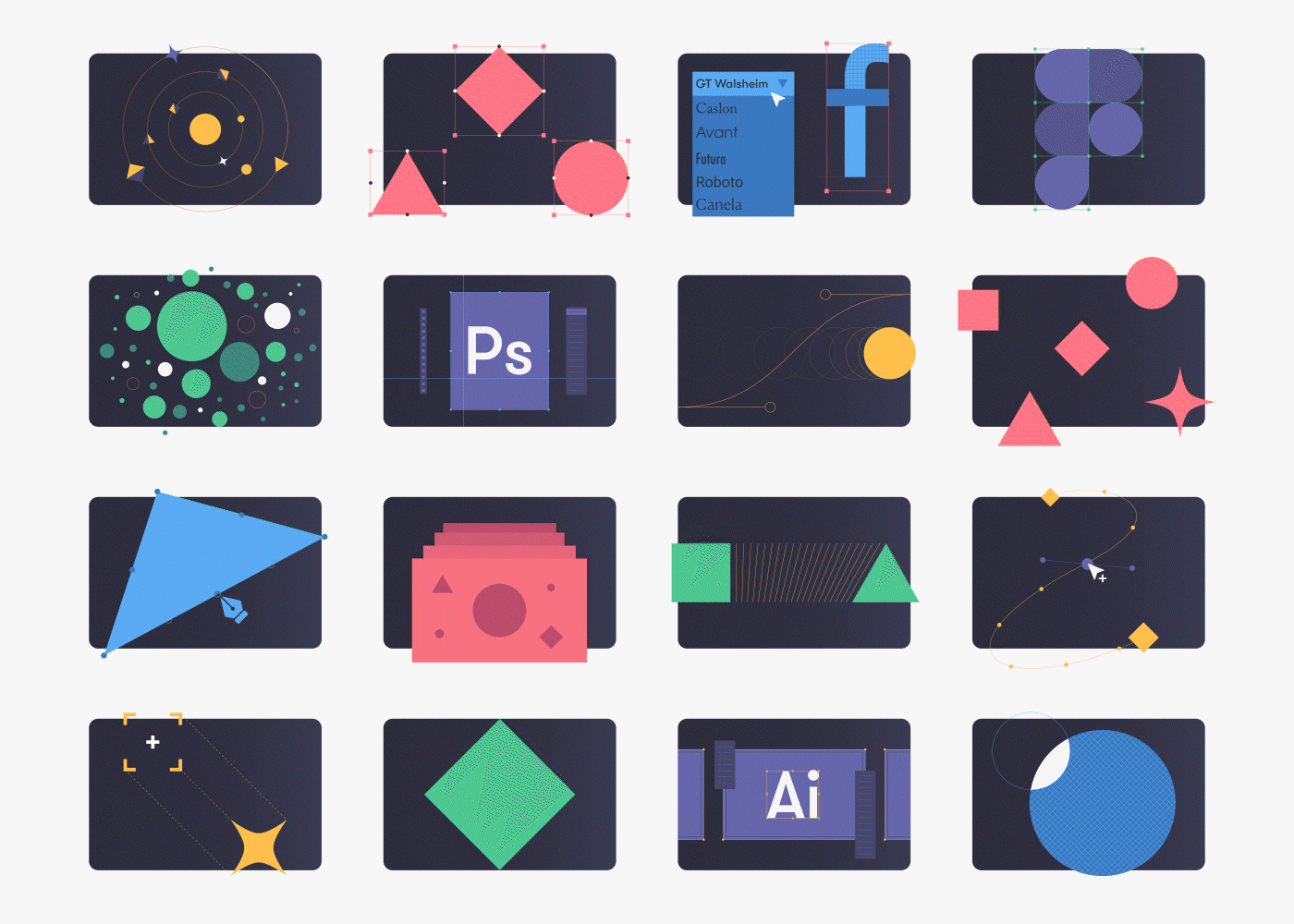
I developed a series of illustrations to establish the visual identity of our illustrative content while also refining and testing the new color palette. My goal was to give Fable a clean, bold look while preserving the geometric qualities of the brand’s original artwork. I aimed for compositions that were engaging without relying on overly complex shapes or literal representations—abstract yet purposeful.


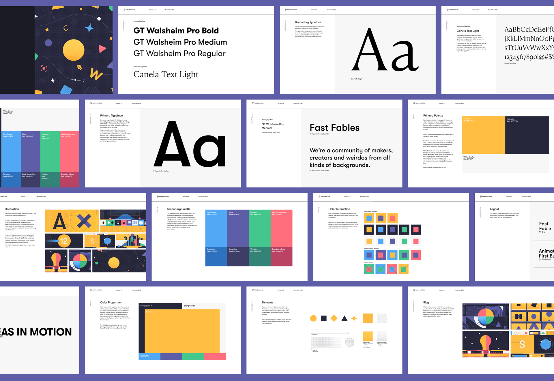
Brand Guide
With a significantly stronger brand direction in place, I updated our brand guide to reflect the new visual identity with greater clarity. This included expanding our color guidelines to define color proportion, hierarchy, and interaction, ensuring a more intentional use of color.
Additionally, I refined our typography, streamlining font selections to a carefully curated set of weights. This approach maintained visual consistency while enhancing readability and efficiency.
Motion
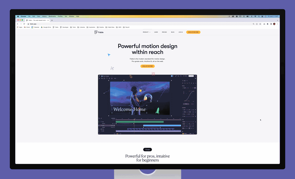
All of our branding efforts were put to the test with our next project: redesigning Fable’s website.
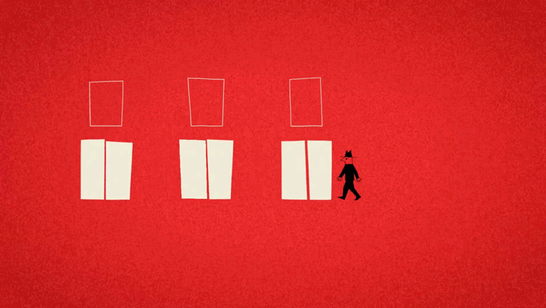
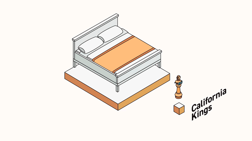
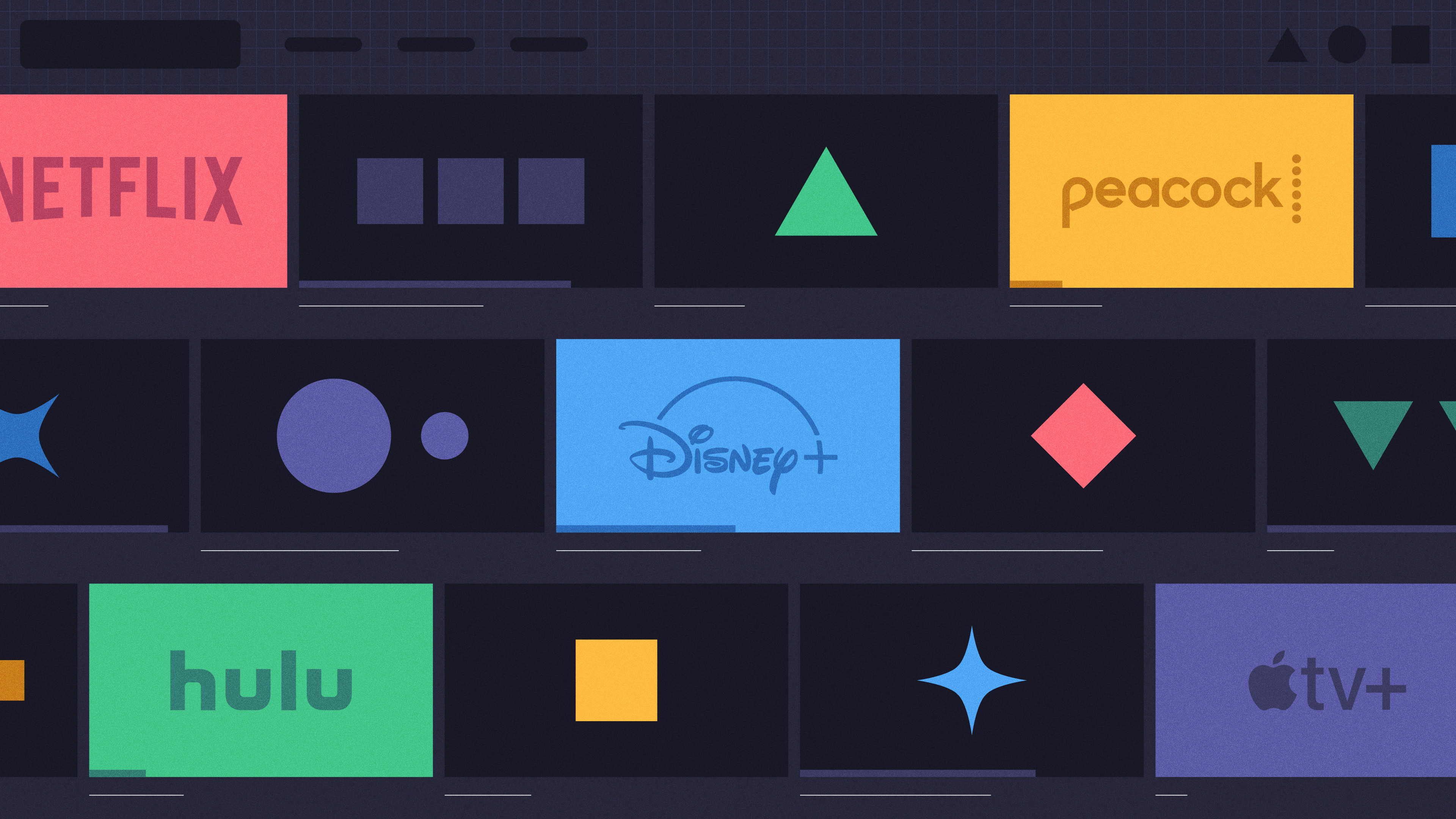
My primary focus was on designing and animating diverse content tailored to each section of the site. At this point our product team was still hard at work developing Fable’s updated UI so in this iteration of the site we wanted to keep things a little more abstract rather than showcasing soon-to-be-outdated UI.
The objective behind these animations was to spotlight some of Fable's capabilities in an engaging and colorful manner, striking a balance between fun and functionality without becoming overly literal.


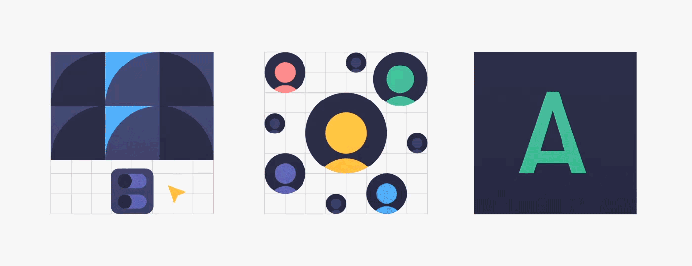


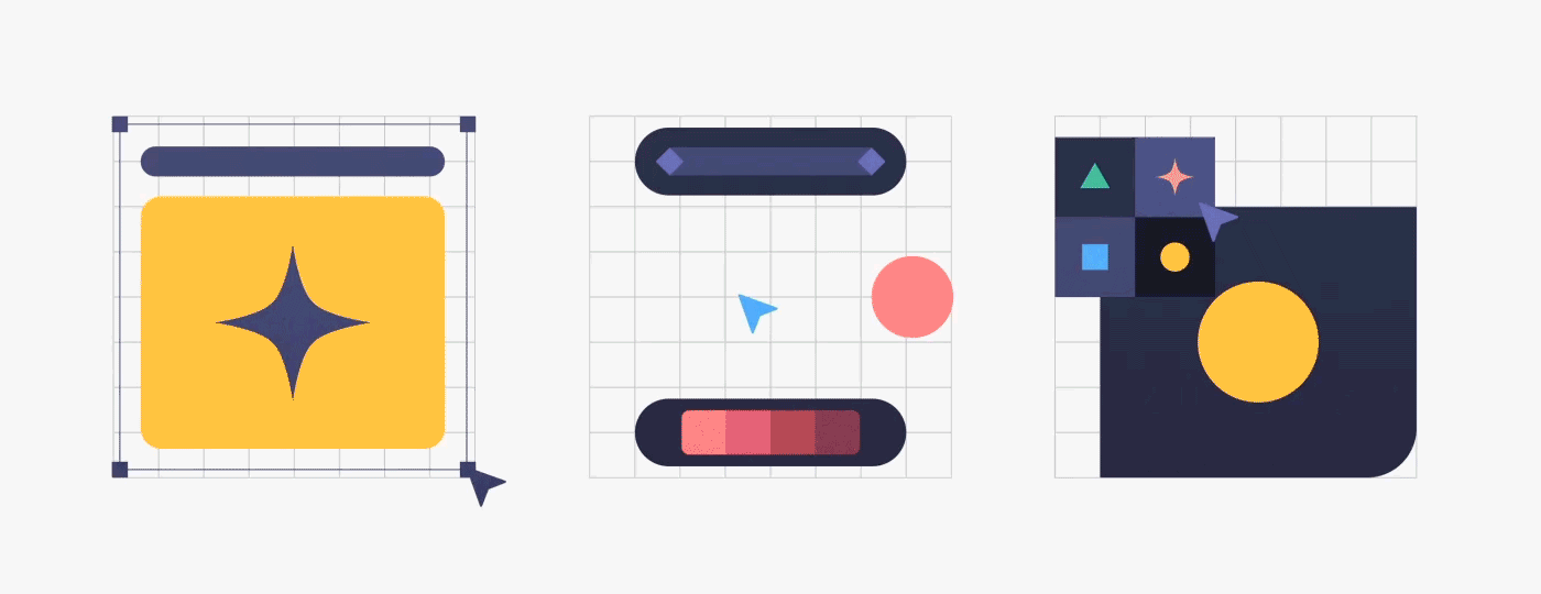
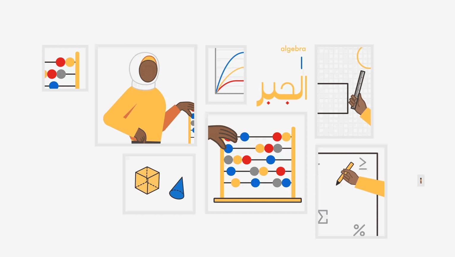
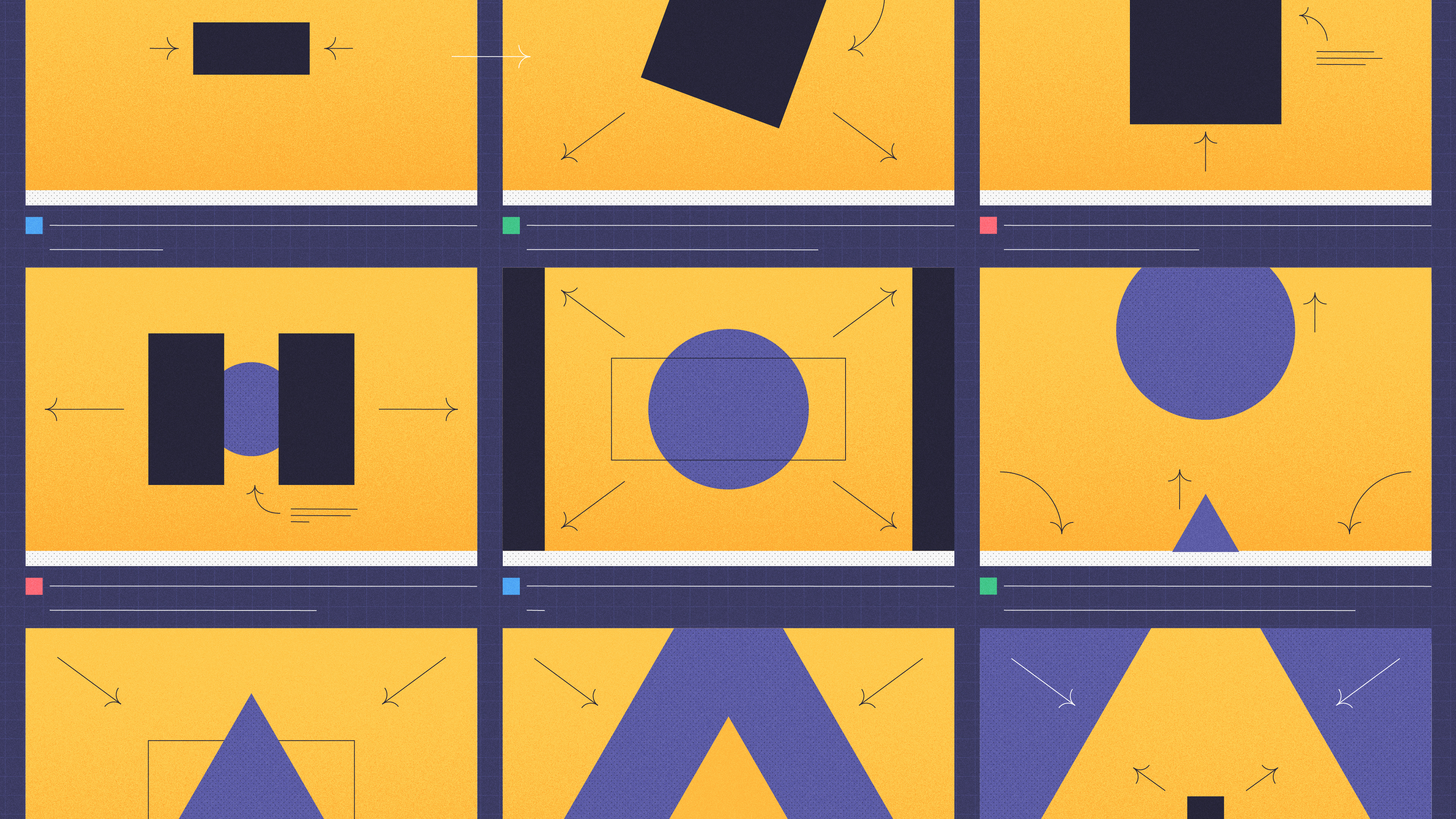
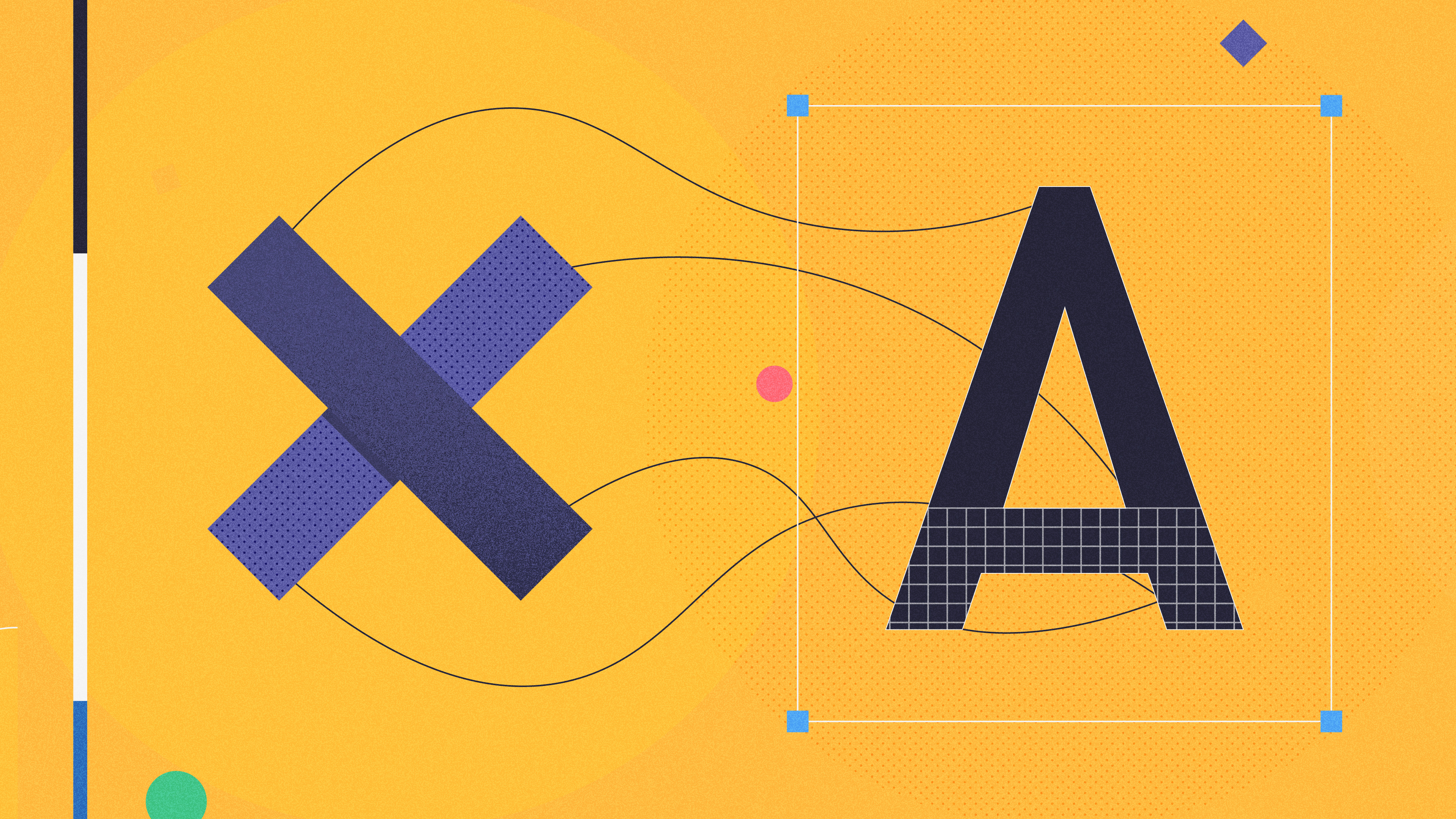
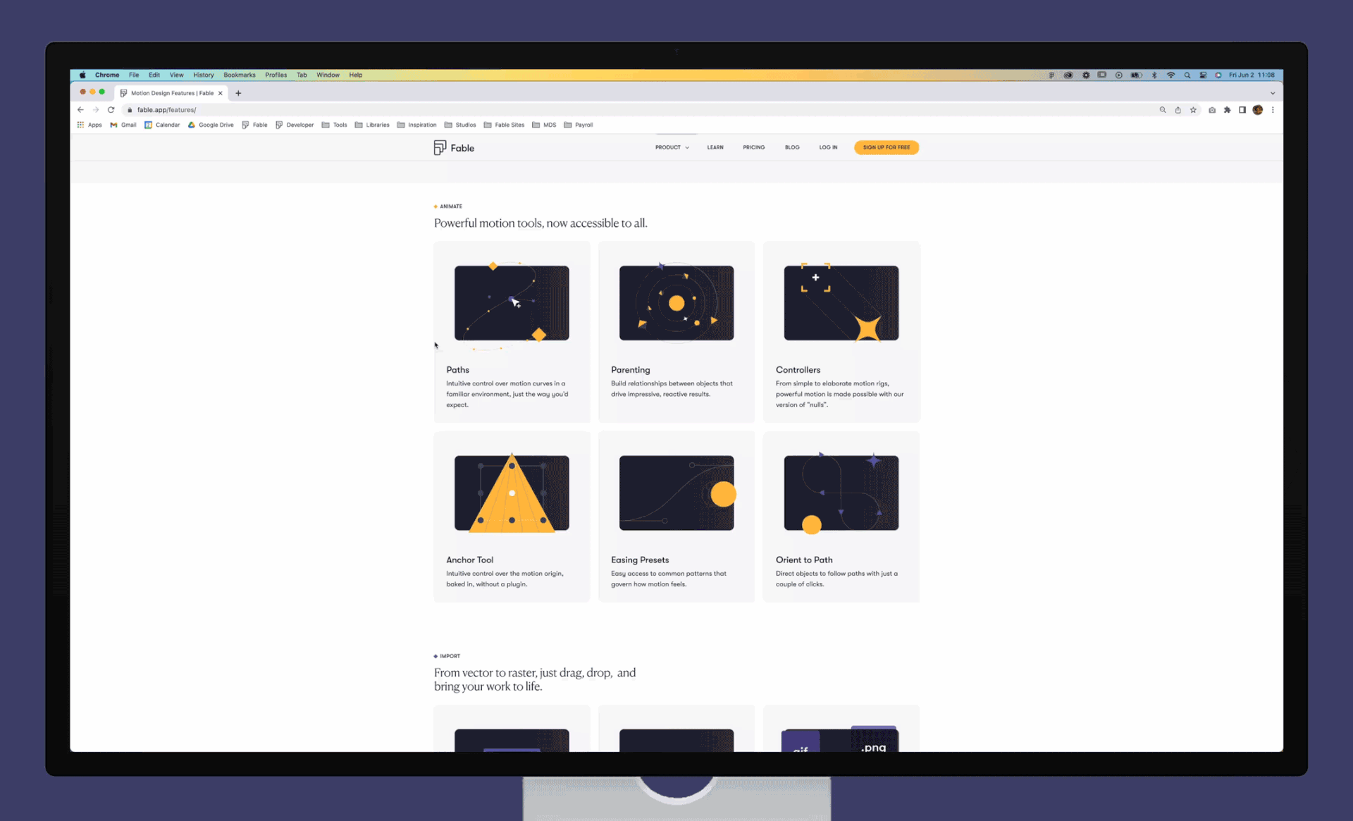
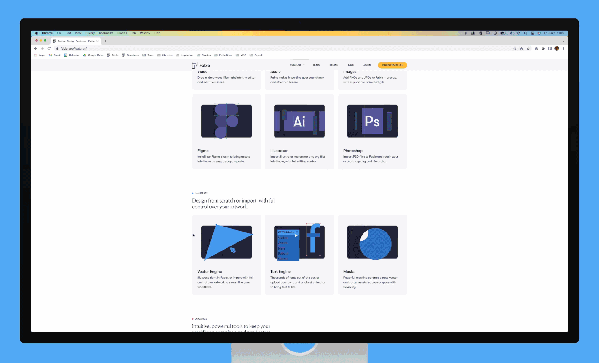
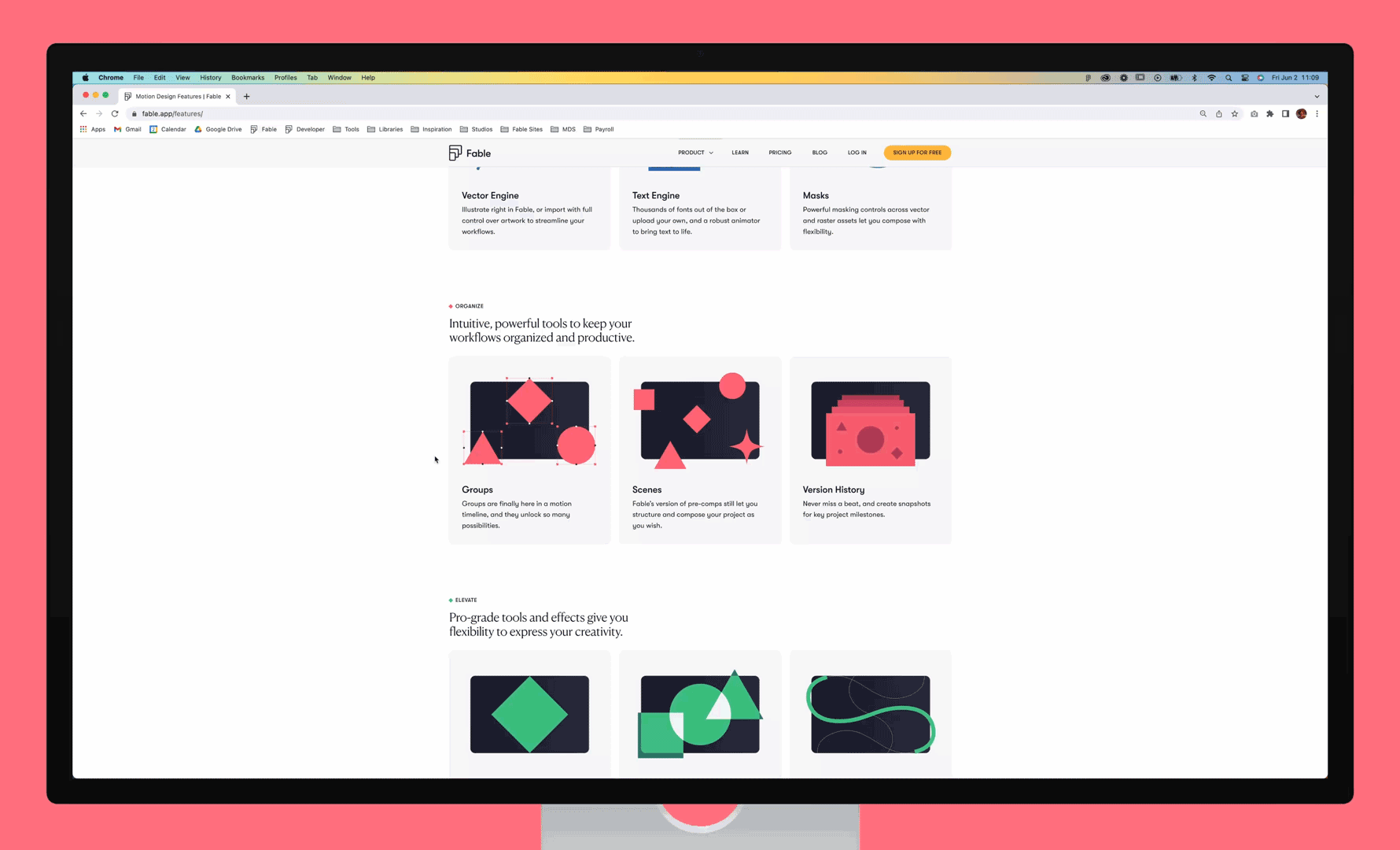
For the features page I crafted small illustrations to represent the various tools and functionalities within Fable. This was a good opportunity to let our secondary palette shine, but also to experiment with our design and ability to showcase complex tools with simple shapes.
The website redesign was a huge success and breathed new life into Fable's digital home. The vibrant colors, clean but bold designs and fun motion revitalized Fable's online identity increasing user engagement and duration of visits.
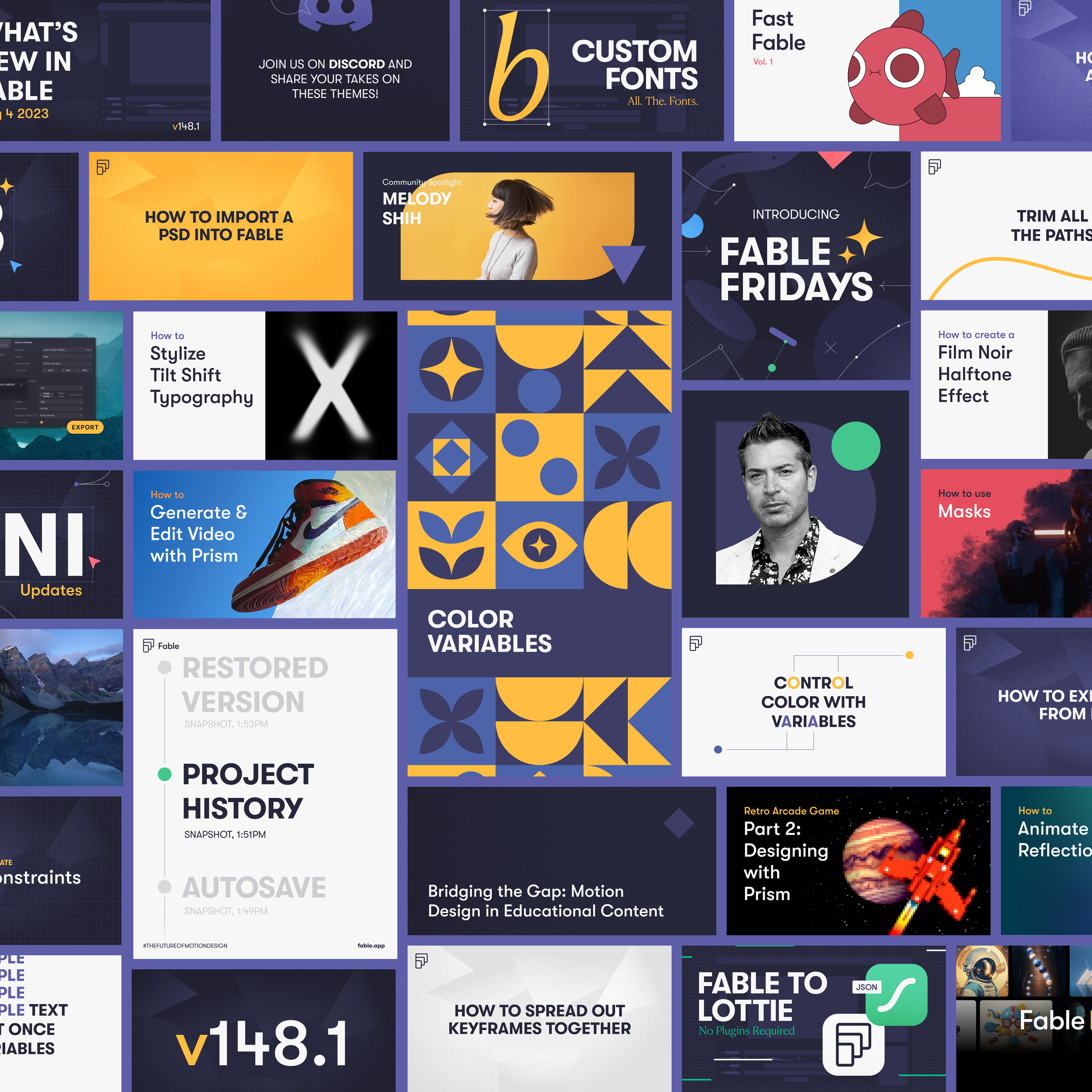
Social Media
Our new branding extended across multiple social platforms, ensuring a cohesive and engaging presence online. From YouTube thumbnails and channel banners to Instagram stories, posts, and beyond, we crafted a diverse range of social media designs. Each piece maintained a fresh, dynamic feel while staying true to our brand identity, creating a unified experience across the digital landscape.
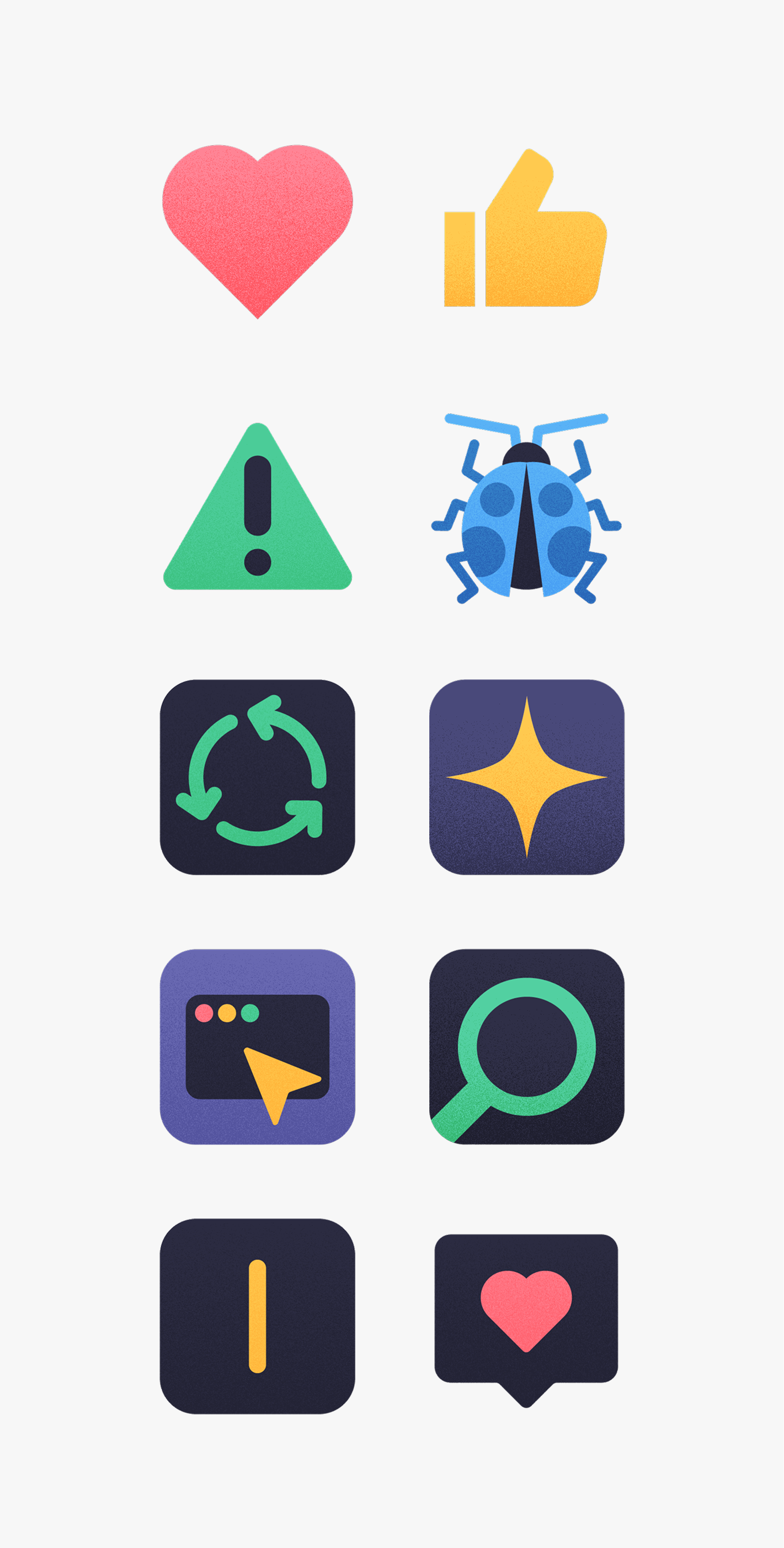
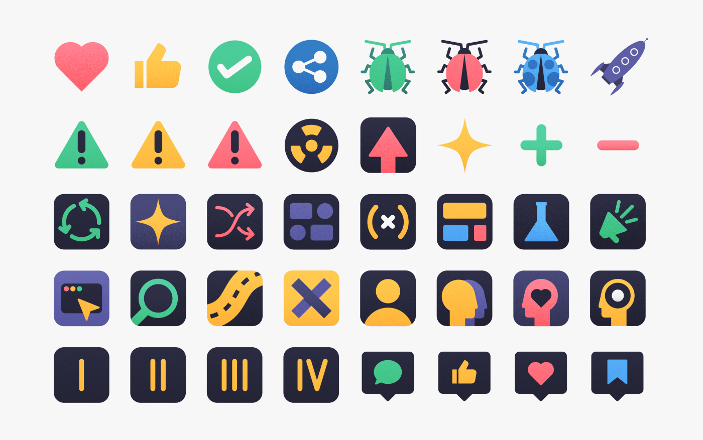
As a natural extension of the rebrand, I designed a set of custom Slack emojis to bring our visual identity into everyday team interactions. These small, branded icons added personality and cohesion to our internal communication, reinforcing the brand’s voice in a fun and engaging way.
Thank you for taking the time to explore this rebranding project. It was a rewarding experience to bring a fresh identity to Fable, and I’m proud of how the final designs came together. I hope you enjoyed seeing the creative process behind it!